Radio button
No accessibility annotations are needed for radio buttons, but keep these considerations in mind if you are modifying Carbon or creating a custom component.
Accessibility testing statusFor every latest release, Carbon runs tests on all components to meet the accessibility requirements. These different statuses report the work that Carbon has done in the back end. These tests appear only when the components are stable.
For every latest release, Carbon runs tests on all components to meet the accessibility requirements. These different statuses report the work that Carbon has done in the back end. These tests appear only when the components are stable.
Latest version: ^1.51.0 | Framework: React (@carbon/react)
| Component | Accessibility test | Status | Link to source code |
|---|---|---|---|
| Radio button | Test(s) that ensure the initial render state of a component is accessible. | Passes all automated tests with no reported accessibility violations. | Github link |
| Tests that ensure additional states of the component are accessible. This could be interactive states of a component or its multiple variants. | Passes all automated tests with no reported accessibility violations. | ||
| Tests that ensure focus is properly managed, and all interactive functions of a component have a proper keyboard-accessible equivalent. | Passes all automated tests with no reported accessibility violations. | ||
| This manual testing ensures that the visual information on the screen is properly conveyed and read correctly by screen readers such as JAWS, VoiceOver, and NVDA. | A human has manually tested this component, e.g. screen reader testing. |
What Carbon provides
Carbon bakes keyboard operation into its components, improving the experience of blind users and others who operate via the keyboard. Carbon incorporates many other accessibility considerations, some of which are described below.
Keyboard interaction
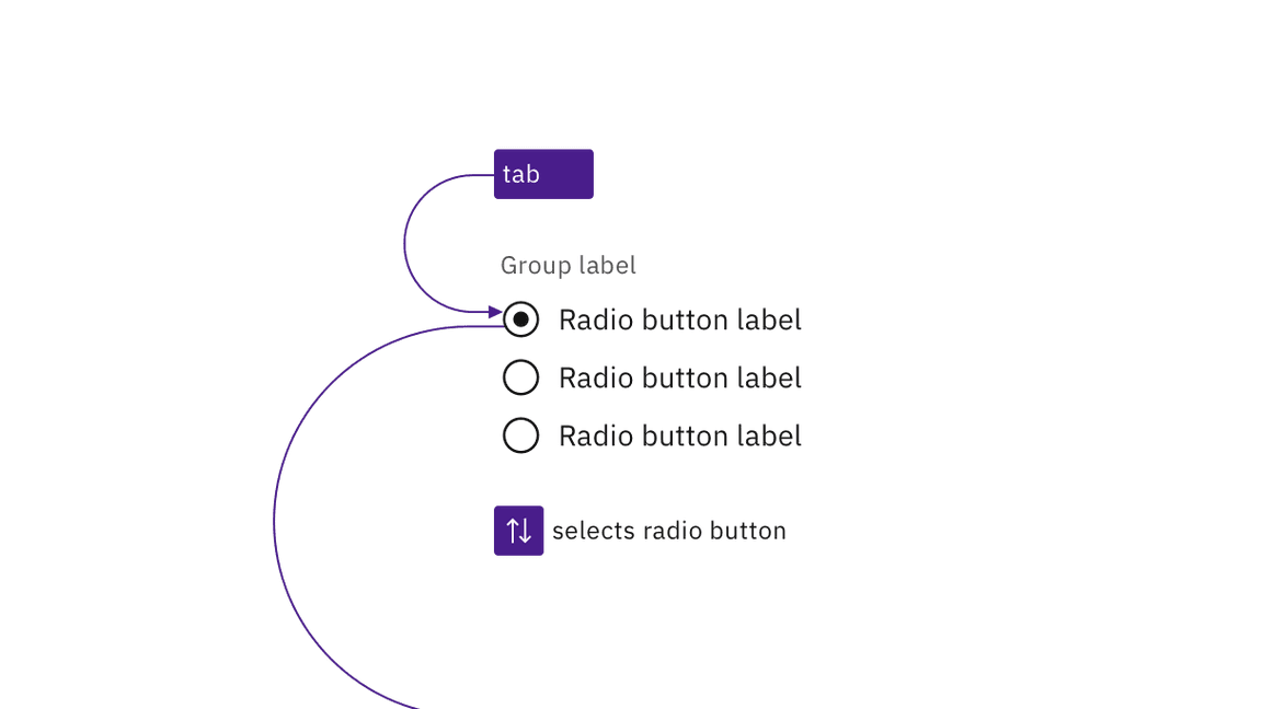
A group of radio buttons takes a single tab stop. Carbon does not require any
item to be selected by default, and the first item will always take focus in
case of no selection. The user changes the selected radio button using the arrow
keys (up/down or left/right). Pressing Tab again will move focus out of the
radio button group to the next component.

A radio button group is a single tab stop and radio buttons are selected using arrow keys.
Labeling and states
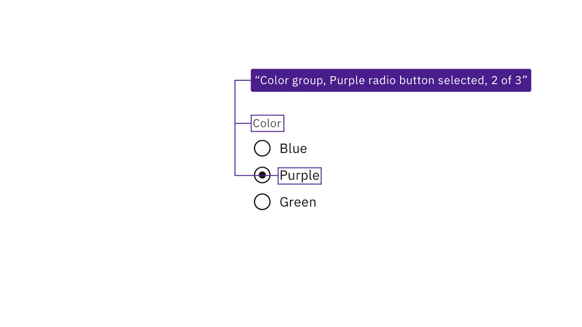
Carbon surfaces the labeling of radio buttons and groups to screen readers and other assistive technologies. Carbon also provides state and context information, such as the number of items in the radio button group.

JAWS screen reader output, based on the information provided by Carbon.
Development considerations
Keep this in mind if you’re modifying Carbon or creating a custom component.
- Carbon uses
fieldsetandlegendto group and label sets of radio buttons. - Carbon uses
labelandforto programmatically connect radio buttons with their labels. - Required radio button groups must be identified programmatically, either via
the label or with
aria-required. - See the ARIA authoring practices for more considerations.